tutorial: watercolour in photoshop
Mar. 8th, 2007 02:58 pmI don't know about anyone else, but I have ALWAYS wished that I could paint. When I was younger, I dreamed of being an artist. Unfortunetly, I seem to lack the necessary hand-eye co-ordination to make this possible. BUT did you know that you can fake a painting? IN PHOTOSHOP!
WARNING: Large images under cut, dial-up beware
Program Used: Adobe Photoshop CS2
I'm a fan of impressionist paintings which is good because it's probably the easier to recreate with digital paint. I've seen brilliant portraits and landscapes done realistically with photoshop, but if you are a beginner, or don't have a tablet, then perhaps this will be a fun little session to get you started!
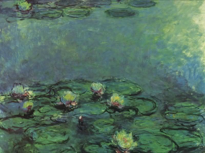
This is the original painting I was trying to imitate.

To start, create a new canvas, perferably something really big, like 1000x1000 pixels so you have alot of room for detail. Also, you don't have to resort to tiny 1px brushes and it's nicer if you want to print your final project.

Don't be daunted by the blank white space, open your brush toolbar which should look like this.

If you have a tablet, you can do much more detailed work, because it senses pressure and you don't have to constantly change the opacity. Your brush toolbar should look like this.

At first I just wanted colour on the canvas. I didn't really care about how it looked, I just wanted a playground. So I used the fill layer and just picked a grey-green. This colour probably wont even appear in the finished product, but I want as many gradations as possible.
(Note: Everything is on one layer, but the CTRL-Z function will remove your last brush stroke.)

So now I'm using my faded circle brush to pick out my shadow and my highlight. Now I know the direction that the light is falling.

After I've got some more colours, I want the brush to have more of an edgier and realistic stroke so I chose this brush and started going over every inch of the canvas with some of the same colours (using the eyedropper tool ALT) and some new colours to give it more of an earthy feel. I was constantly changing my opacity and brush size to get new effects. This is something you'll have to work out for yourself depending on the effect you want. Remember to play alot with the strokes, keeping them short and to change size or opacity or colour at least every five strokes. Regular paint mixes when it's blended together, and I wanted this to look properly blended.

Next I want some shapes. I'm just randomly choosing where I want my lily pads, but I'm marking them out with highlights and lowlights. Remember to go outside of your colour zone and never use true white or black. For an accent, yellow or pink works and purple or blue make good shadows. Nature uses all of these colours, so don't just stick with green.

Here you can see the change between the brushes. Monet daubbed with his work and I wanted more of a square effect to imitate the quick slap and dab of his work. It's more obvious, but eventually I blend it in. Also, a bit more definition with the pads, this was about 40 minutes in. It takes a long time when you're constantly adjusting your opacity to get the effect you want, but it was fun.

Here I'm trying to sketch out where I want the water lilies to sit, and I'm always changing my background, even up until the very last step. Once you make a new stroke, you need to blend it in. Which then needs to be blended into the part beside it, and so on. It looks better if it's all uniform.

First attempt at the water lilies, I switched back to the circle brush to get more of an outline that I used as my guide.

Here I decided that I wanted MORE lily pads, so I set to work sketching out the area that I wanted them to be. I filled in teh new circles with the same highlights and lowlights.

I softened my guide-lines to help the lilies and pads blend with the water. Whole project took me two hours and helped me get my job working in communications media and web design.

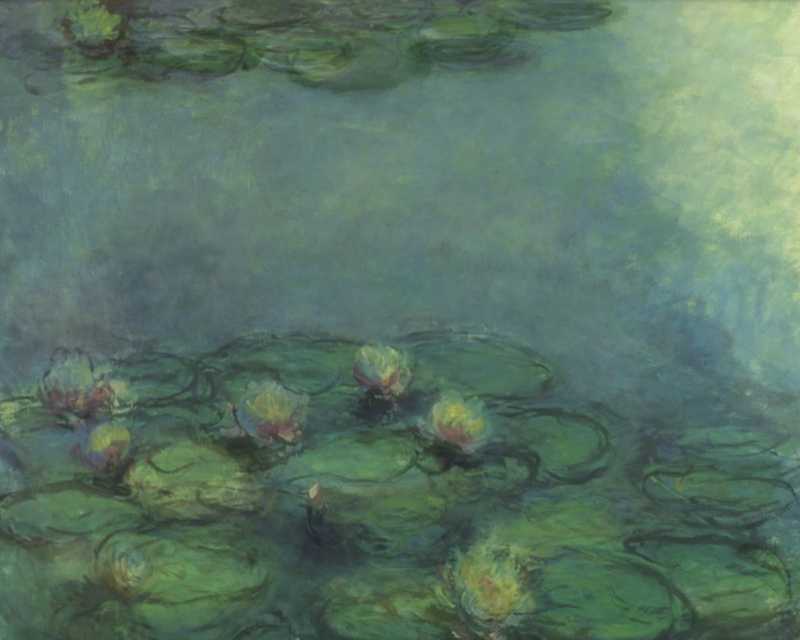
Finished Product! YAY!

Large Versions: (1000x800 px) original & mine
Remember that all of Monet's painting were 'studies of light', everything casts a shadow and you need to carefully layer your shading to reflect the three-dimensional qualities of the object you are painting. It takes longer, but it looks much better than simply using the burn or dodge tools.
WARNING: Large images under cut, dial-up beware
Program Used: Adobe Photoshop CS2
I'm a fan of impressionist paintings which is good because it's probably the easier to recreate with digital paint. I've seen brilliant portraits and landscapes done realistically with photoshop, but if you are a beginner, or don't have a tablet, then perhaps this will be a fun little session to get you started!
This is the original painting I was trying to imitate.
To start, create a new canvas, perferably something really big, like 1000x1000 pixels so you have alot of room for detail. Also, you don't have to resort to tiny 1px brushes and it's nicer if you want to print your final project.
Don't be daunted by the blank white space, open your brush toolbar which should look like this.
If you have a tablet, you can do much more detailed work, because it senses pressure and you don't have to constantly change the opacity. Your brush toolbar should look like this.
At first I just wanted colour on the canvas. I didn't really care about how it looked, I just wanted a playground. So I used the fill layer and just picked a grey-green. This colour probably wont even appear in the finished product, but I want as many gradations as possible.
(Note: Everything is on one layer, but the CTRL-Z function will remove your last brush stroke.)
So now I'm using my faded circle brush to pick out my shadow and my highlight. Now I know the direction that the light is falling.
After I've got some more colours, I want the brush to have more of an edgier and realistic stroke so I chose this brush and started going over every inch of the canvas with some of the same colours (using the eyedropper tool ALT) and some new colours to give it more of an earthy feel. I was constantly changing my opacity and brush size to get new effects. This is something you'll have to work out for yourself depending on the effect you want. Remember to play alot with the strokes, keeping them short and to change size or opacity or colour at least every five strokes. Regular paint mixes when it's blended together, and I wanted this to look properly blended.
Next I want some shapes. I'm just randomly choosing where I want my lily pads, but I'm marking them out with highlights and lowlights. Remember to go outside of your colour zone and never use true white or black. For an accent, yellow or pink works and purple or blue make good shadows. Nature uses all of these colours, so don't just stick with green.
Here you can see the change between the brushes. Monet daubbed with his work and I wanted more of a square effect to imitate the quick slap and dab of his work. It's more obvious, but eventually I blend it in. Also, a bit more definition with the pads, this was about 40 minutes in. It takes a long time when you're constantly adjusting your opacity to get the effect you want, but it was fun.
Here I'm trying to sketch out where I want the water lilies to sit, and I'm always changing my background, even up until the very last step. Once you make a new stroke, you need to blend it in. Which then needs to be blended into the part beside it, and so on. It looks better if it's all uniform.
First attempt at the water lilies, I switched back to the circle brush to get more of an outline that I used as my guide.
Here I decided that I wanted MORE lily pads, so I set to work sketching out the area that I wanted them to be. I filled in teh new circles with the same highlights and lowlights.
I softened my guide-lines to help the lilies and pads blend with the water. Whole project took me two hours and helped me get my job working in communications media and web design.
Finished Product! YAY!
Large Versions: (1000x800 px) original & mine
Remember that all of Monet's painting were 'studies of light', everything casts a shadow and you need to carefully layer your shading to reflect the three-dimensional qualities of the object you are painting. It takes longer, but it looks much better than simply using the burn or dodge tools.
no subject
Date: 2007-03-09 12:24 am (UTC)SO AMAZING!!
Definitely trying this later, aksjhfkahs. THANKS! Your final product is so coooool.
no subject
Date: 2007-03-09 05:12 am (UTC)no subject
Date: 2007-03-09 11:53 am (UTC)I'm definitely +mems & trying this out.
no subject
Date: 2007-03-09 01:07 pm (UTC)Oooh, try it! It's alot of fun! And show me what your finished product is please!